
 Search
 Feedback
 About UniCat
  Help
Help News
News
| Listing 1 - 10 of 28 | << page >> |
Sort by
|
Book
ISBN: 9783361002036 3361002036 Year: 1990 Publisher: Leipzig: Leipzig,
Abstract | Keywords | Export | Availability | Bookmark
 Loading...
Choose an application
- Reference Manager
- EndNote
- RefWorks (Direct export to RefWorks)
Ce livre relève principalement des affiches de theâtres et fait un large tour d'horizon en passant par la France avec Paris, l'Italie et l'affiche d'opera, l'Angleterre avec Londres, l'Allemagne avec Berlin, Métropole des theâtres et des affiches. Il est illustré de 400 affiches.
Book
ISBN: 3959051786 9783959051781 Year: 2017 Publisher: Leipzig: Spector Books,
Abstract | Keywords | Export | Availability | Bookmark
Loading...Choose an application
- Reference Manager
- EndNote
- RefWorks (Direct export to RefWorks)
"Lucerne--Switzerland's poster town--has a vibrant graphic design scene, which in recent years has become known for its sophisticated posters well beyond the country's borders. Professional colleagues are in awe of how a relatively small city can produce so many well-designed posters. Lucerne posters can be found in many exhibitions. To give one example : in 2015 alone, twenty-six of the hundred best posters from Germany, Austria, and Switzerland came from Lucerne and the surrounding area - in other words, more than a quarter of all the awardwinning works. What's behind this? Is it coincidence or a preponderance of designers of above-average talent in a comparatively small area? The book Poster Town tracks this phenomenon with a wealth of images and texts and creates a record of Lucerne's poster designs for posterity.
Affiche --- Affiche publicitaire --- Lucerne
Book
Abstract | Keywords | Export | Availability | Bookmark
Loading...Choose an application
- Reference Manager
- EndNote
- RefWorks (Direct export to RefWorks)
Affiche --- Vormgeving
Book
Abstract | Keywords | Export | Availability | Bookmark
Loading...Choose an application
- Reference Manager
- EndNote
- RefWorks (Direct export to RefWorks)
Affiche --- Vormgeving
Book
ISBN: 9783830713357 Year: 2007 Publisher: München Stiebner
Abstract | Keywords | Export | Availability | Bookmark
Loading...Choose an application
- Reference Manager
- EndNote
- RefWorks (Direct export to RefWorks)
Affiche --- Vormgeving
Book
ISBN: 9783900364083 3900364087 Year: 1993 Publisher: Vienne: GDA-Geschäftstelle,
Abstract | Keywords | Export | Availability | Bookmark
Loading...Choose an application
- Reference Manager
- EndNote
- RefWorks (Direct export to RefWorks)
Affiche --- Affiche publicitaire --- Graphisme --- Autriche
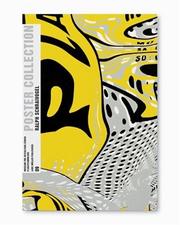
ISBN: 3037780169 9783037780169 Year: 2003 Publisher: Baden: Museum für Gestaltung Zürich, Lars Müller,
Abstract | Keywords | Export | Availability | Bookmark
Loading...Choose an application
- Reference Manager
- EndNote
- RefWorks (Direct export to RefWorks)
With every new project Schraivogel gives the impression of calling his past experience into question. Therefore, from one poster to the next, there exists great - and sometimes rather unsettling - diversity, as if different artists were involved. Sometimes the typography takes pride of place, other times the illustration. other times still, the two are mixed, the lettering and the drawing inextricably linked.( Robert Massin) (quatrième de couverture)
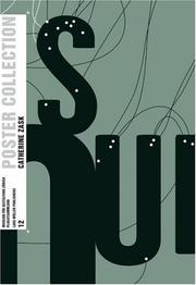
ISBN: 3037780541 9783037780541 Year: 2005 Publisher: Baden: Museum für Gestaltung Zürich, Lars Müller,
Abstract | Keywords | Export | Availability | Bookmark
Loading...Choose an application
- Reference Manager
- EndNote
- RefWorks (Direct export to RefWorks)
Ce que Catherine Zask transmet, c'est la force primitive du mot et de la lettre. Et le message est d'autant plus sonore que l'alphabet qu'elle utilise reste phonétique dans le même temps qu'il éclate visuellement et que "l'oeil écoute". Henri Gaudin. (quatrième de couverture)
Book
Abstract | Keywords | Export | Availability | Bookmark
Loading...Choose an application
- Reference Manager
- EndNote
- RefWorks (Direct export to RefWorks)
Grootformaat --- Affiche --- Vormgeving --- Druktechniek
Book
ISBN: 3817020244 9783817020249 Year: 1992 Publisher: [Lieu de publication inconnu]: Weingarten,
Abstract | Keywords | Export | Availability | Bookmark
Loading...Choose an application
- Reference Manager
- EndNote
- RefWorks (Direct export to RefWorks)
Catalogue regroupant les affiches constructivistes du début du siècle.
Peintre --- Affiche --- Constructivisme --- Rodtchenko, Alexandre
| Listing 1 - 10 of 28 | << page >> |
Sort by
|