
 Search
 Feedback
 About
About Help
Help News
News
| Listing 1 - 10 of 123 | << page >> |
Sort by
|
Book
ISBN: 9782867423116 2867423112 Year: 2022 Publisher: [Paris] : Aux éditions des Cendres,
Abstract | Keywords | Export | Availability | Bookmark
 Loading...
Choose an application
- Reference Manager
- EndNote
- RefWorks (Direct export to RefWorks)
Typographie classique par excellence, le Garamond est désormais omniprésent. Ses innombrables variantes numériques dominent de façon écrasante le paysage éditorial, et la quasi-totalité des ordinateurs de la planète possède au moins une police qui s’y rattache. Les caractères en usage aujourd’hui s’inspirent de l’œuvre d’un modeste artisan du seizième siècle : Claude Garamont. Personnage à la fois célèbre et mal connu,né vers 1515 et mort en 1561, ce graveur parisien se fit connaître en son temps comme l’un des grands rénovateurs de la typographie, au point d’être distingué par François Ier, qui fit de lui le « graveur de caractères du roi » et lui passa de prestigieuses commandes.En s’appuyant sur un ensemble d’archives souvent inédites, cet ouvrage propose une synthèse biographique sur la carrière de Garamont. À travers le parcours singulier de ce modeste artisan, il apporte un éclairage nouveau à l’histoire de l’humanisme français et du livre à la Renaissance. --Éditions des Cendres
Typographie --- Humanisme de la Renaissance. --- Garamont, Claude --- 655.244 --- 655.244 Lettersoorten--in de drukkunst --- 655.244 Typefaces. Antiqua (Old Style). Sanserif. Blackletter etc. --- Lettersoorten--in de drukkunst --- Typefaces. Antiqua (Old Style). Sanserif. Blackletter etc. --- Graphic arts --- typefaces [type forms]
Book
ISBN: 9781782402879 Year: 2015 Publisher: Lewes Ivy press
Abstract | Keywords | Export | Availability | Bookmark
Loading...Choose an application
- Reference Manager
- EndNote
- RefWorks (Direct export to RefWorks)
Book
ISBN: 9789460580659 Year: 2011 Publisher: Antwerpen Luster
Abstract | Keywords | Export | Availability | Bookmark
Loading...Choose an application
- Reference Manager
- EndNote
- RefWorks (Direct export to RefWorks)
80659
Lettertypes --- Typografen --- Letterontwerpers --- Graphics industry --- Literature --- 655.244 --- 655.26 --- Typefaces. Antiqua (Old Style). Sanserif. Blackletter etc. --- Soorten zetwerk. Lay-out. Typografische vormgeving --- Lettertype --- Typograaf --- Letterontwerper --- Typefaces. Antiqua (Old Style). Sanserif. Blackletter etc
Book
ISBN: 071371347X Year: 1983 Publisher: Poole Blandford press
Abstract | Keywords | Export | Availability | Bookmark
Loading...Choose an application
- Reference Manager
- EndNote
- RefWorks (Direct export to RefWorks)
Printing --- Type and type-founding --- 655.244 <03> --- Fonts (Printing) --- Founts (Printing) --- Metal types --- Type faces --- Typefaces --- Founding --- Typesetting --- Specimens --- Typografische lettersoorten--in de drukkunst--Naslagwerken. Referentiewerken --- Graphic arts --- letters [signs] --- typefaces [type forms] --- typografie
Book
ISBN: 9791092058536 Year: 2021 Publisher: Paris Magnani
Abstract | Keywords | Export | Availability | Bookmark
Loading...Choose an application
- Reference Manager
- EndNote
- RefWorks (Direct export to RefWorks)
Personnalité incontournable et historique dans le design graphique et l’édition, Étienne Robial est au croisement de plusieurs disciplines : artiste, éditeur, enseignant, et designer. L’homme rassemble aujourd’hui dans ce livre ses mémoires d’orfèvre du regard, de manipulateur visuel et d’historien des formes. Le concepteur de l’identité visuelle télévisée la plus marquante du XXe siècle (Canal+) soumet à la postérité l’ensemble complet de tous ses travaux, toutes ses recherches personnelleset contributions célèbres ou méconnues à partir des alphabets qu’il a conçu tout au long de sa carrière.Sur 400 pages abondamment illustrées par des photoset des croquis issues de ses archives personnelles(plus de 2000 documents), Étienne Robial détaille et commente lui-même 50 ans de travail qui appartient maintenant au patrimoine culturel français(Futuropolis, Métal Hurlant, À Suivre, L’Équipe,Les Inrocks, PSG…). La relation clé qu’entretientÉtienne Robial avec les alphabets, sa science,son art et son érudition de la lettre et de l’image habitent les pages de ce livre et sont maintenant à partager avec tous les amateurs d’art, de design et d’histoire ; qu’ils soient profanes, étudiants ou professionnels. Ouvrage-somme de référence sur l’intégralité de l’œuvre de Étienne Robial, cette monographie désire faire rencontrer au public actuelet futur toute l’œuvre et la chaleur d’un créateur français hors du commun. Préfaces de Pierre Lescureet de 26 personnalités du graphisme, de l'éditionet de la bande dessinée. --Éditions Magnani
Book
ISBN: 3034609892 9783034609890 9783764385767 Year: 2009 Publisher: Basel Boston Birkhäuser
Abstract | Keywords | Export | Availability | Bookmark
Loading...Choose an application
- Reference Manager
- EndNote
- RefWorks (Direct export to RefWorks)
Das internationale Schriftschaffen nach 1950 wurde massgeblich geprägt vom Schweizer Adrian Frutiger. Sein Schriftprogramm Univers und die zum ISO-Standard erklärte maschinenlesbare Schrift OCR-B sind Meilensteine wie auch die zur Frutiger weiterentwickelte Schrift der Pariser Flughäfen - ein Qualitätsstandard für Signalisationsschriften. Mit den Corporate Types prägte er Firmenauftritte wie jenen der japanischen Kosmetiklinie Shiseido. Insgesamt entstanden rund 50 Schriften, darunter Ondine, Méridien, Avenir, Vectora.Auf Gesprächen mit Frutiger basierend sowie auf umfangreichen Recherchen in Frankreich, England, Deutschland und der Schweiz zeichnet die Publikation den gestalterischen Werdegang des Schriftkünstlers exakt nach. Erstmals werden alle Schriften - vom Entwurf bis zur Vermarktung - abgebildet sowie mit Bezug zu Technik und zu artverwandten Schriften analysiert. Bisher unveröffentlichte, nicht realisierte Schriften sowie über 100 Logos vervollständigen das Bild. The international creation of typefaces after 1950 was decisively influenced by the Swiss type designer Adrian Frutiger. His Univers typeface and the machine-readable font OCR-B, which was adopted as an ISO standard, are milestones, as is his type for the Paris airports, which set new standards for signage types and evolved into the Frutiger typeface. With his corporate types, he helped to define the public profiles of companies such as the Japanese Shiseido line of cosmetics. In all he created some fifty types, including Ondine, Méridien, Avenir, and Vectora.Based on conversations with Frutiger himself and on extensive research in France, England, Germany, and Switzerland, this publication provides a highly detailed and accurate account of the type designer's artistic development. For the first time, all of his types - from the design phase to the marketing stage - are illustrated and analyzed with reference to the technology and related types. Hitherto unpublished types that were never realized and more than one hundred logos complete the picture.
Type and type-founding. --- Fonts (Printing) --- Founts (Printing) --- Metal types --- Type faces --- Typefaces --- Founding --- Printing --- Typesetting --- Frutiger, Adrian,
Book

ISBN: 9783777222127 3777222127 Year: 2022 Publisher: Stuttgart Anton Hiersemann
Abstract | Keywords | Export | Availability | Bookmark
Loading...Choose an application
- Reference Manager
- EndNote
- RefWorks (Direct export to RefWorks)
Typographie als jede Form gestalteter Schrift ist ein wichtiges Mittel der Schriftkommunikation. Sie ist geprägt von vielfältigen, sich wandelnden soziokulturellen Bedingungen, ihr Verständnis damit Aufgabe vieler Disziplinen. Der ansprechend gestaltete Band versammelt 21 illustrierte Überblicksartikel und damit verbundene Fallstudien zu zentralen typographischen Themen, verfasst von ausgewiesenen FachwissenschaftlerInnen. Alle Beiträge sind inhaltlich eng miteinander vernetzt, ihre Zugänge reichen von der Semiotik und Schriftlinguistik bis zur Literatur-, Übersetzungs- und Editionswissenschaft und weiter zur Buchwissenschaft und Kunstgeschichte.
Graphic arts --- printing [process] --- graphic design --- semiotics --- printmaking --- layouts [printer matter] --- typography --- Printing --- Type and type-founding --- 655.244 <03> --- 655.244 <03> Typefaces. Antiqua (Old Style). Sanserif. Blackletter etc.--Naslagwerken. Referentiewerken --- 655.244 <03> Typografische lettersoorten--in de drukkunst--Naslagwerken. Referentiewerken --- Typefaces. Antiqua (Old Style). Sanserif. Blackletter etc.--Naslagwerken. Referentiewerken --- Typografische lettersoorten--in de drukkunst--Naslagwerken. Referentiewerken --- Fonts (Printing) --- Founts (Printing) --- Metal types --- Type faces --- Typefaces --- Founding --- Typesetting --- History --- layouts [printed matter]
ISBN: 080087921X 9780800879211 Year: 1978 Publisher: New York (N.Y.): Taplinger
Abstract | Keywords | Export | Availability | Bookmark
Loading...Choose an application
- Reference Manager
- EndNote
- RefWorks (Direct export to RefWorks)
Graphic design (Typography) --- Type and type-founding --- 655.262 --- Typographic design --- Design --- Printing --- Layout (Printing) --- Fonts (Printing) --- Founts (Printing) --- Metal types --- Type faces --- Typefaces --- Founding --- Typesetting --- Boekdesign--algemeen
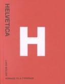
ISBN: 3907044878 Year: 2002 Publisher: Baden Lars Müller
Abstract | Keywords | Export | Availability | Bookmark
Loading...Choose an application
- Reference Manager
- EndNote
- RefWorks (Direct export to RefWorks)
Helvetica is not only the preferred typeface of leading professionals, it is also an all-time favourite among the multitude of codes, signals and signs that flavour urban life. In 1957, Swiss typographer Max Miedinger (1910-1980) came up with “Haas Grotesk”. Renamed Helvetica after 1960, this typeface went on to become one of the world’s most used typefaces ever. It embodies the myth of Sachlichkeit, propagated at the time by Swiss Typography. This book sings the praises of the honest worker and solo entertainer of typefaces, Helvetica, and of its forgotten creator and all those who have contributed to its unparalleled international march of triumph over the past forty years. Filled with pages of color images of Helvetica in use, from album covers and road signs to advertisements and product packaging, the designs gathered together in honor of Helvetica have been created by superb designers and anonymous amateurs from all over the world. The result is an exciting collection of this icon of modern design.
Graphic signs
---
lettertypes
---
typography
---
typografie
---
typefaces [type forms]
---
Lettertypes
---
655.24
---
#BIBC:ruil
Book
ISBN: 3038216577 3038212601 9783038212607 9783038215264 Year: 2014 Publisher: Basel
Abstract | Keywords | Export | Availability | Bookmark
Loading...Choose an application
- Reference Manager
- EndNote
- RefWorks (Direct export to RefWorks)
Das internationale Schriftschaffen nach 1950 wurde maßgeblich geprägt vom Schweizer Adrian Frutiger. Sein Schriftprogramm Univers und die zum ISO-Standard erklärte, maschinenlesbare Schrift OCR-B sind ebenso Meilensteine wie die zur Frutiger weiterentwickelte Schrift der Pariser Flughäfen - ein Qualitätsstandard für Signalisationsschriften. Mit den Corporate Types prägte er Firmenauftritte wie den der japanischen Kosmetiklinie Shiseido. Insgesamt entstanden rund 50 Schriften, darunter Ondine, Méridien, Avenir und Vectora.Auf Gesprächen mit Frutiger basierend sowie auf umfangreichen Recherchen in Frankreich, England, Deutschland und der Schweiz, zeichnet die Publikation den gestalterischen Werdegang des Schriftkünstlers exakt nach. Es werden alle Schriften - vom Entwurf bis zur Vermarktung - abgebildet sowie mit Bezug zu Technik und zu artverwandten Schriften analysiert. Bisher unveröffentlichte, nicht realisierte Schriften sowie über 100 Logos vervollständigen das Bild. Mit dieser zweiten Auflage, einer korrigierten und durch einen Index erweiterten Studienausgabe, lässt sich Frutigers Werk noch besser erschliessen. The international creation of typefaces after 1950 was decisively influenced by the Swiss type designer Adrian Frutiger. His Univers typeface and the machine-readable font OCR-B, which was adopted as an ISO standard, are milestones, as is his type for the Paris airports, which set new standards for signage types and evolved into the Frutiger typeface. With his corporate types, he helped to define the public profiles of companies such as the Japanese Shiseido line of cosmetics. In all he created some fifty types, including Ondine, Méridien, Avenir, and Vectora. Based on conversations with Frutiger himself and on extensive research in France, England, Germany, and Switzerland, this publication provides a highly detailed and accurate account of the type designer's artistic development. All of his types - from the design phase to the marketing stage - are illustrated and analyzed with reference to the technology and related types. Hitherto unpublished types that were never realized and more than one hundred logos complete the picture. This second, revised and expanded study edition, which now has an index, makes Frutiger's achievement even more accessible.
Type and type-founding. --- Type and type-founding --- Fonts (Printing) --- Founts (Printing) --- Metal types --- Type faces --- Typefaces --- Founding --- Printing --- Typesetting --- History --- Frutiger, Adrian,
| Listing 1 - 10 of 123 | << page >> |
Sort by
|