
 Search
 Feedback
 About
About Help
Help News
News
| Listing 1 - 10 of 27 | << page >> |
Sort by
|
Book
ISBN: 9781592538980 1592538983 1306572975 162788050X 9781306572972 9781627880503 Year: 2014 Publisher: Beverly (Mass.) Rockport Publishers
Abstract | Keywords | Export | Availability | Bookmark
 Loading...
Choose an application
- Reference Manager
- EndNote
- RefWorks (Direct export to RefWorks)
Part inspiration and part workbook, these hand-drawn type of images will inspire and excite any designer to draw and explore type. Drawing Type features real-world projects and sketchbooks of well-known type designers, including interviews about their processes. Playful, hand-drawn type can easily be used in a range of disciplines within design and illustration such as packaging, editorial, posters, advertising, online graphics, and signage; the hand-made aesthetic is more prevalent now than ever.Alex Fowkes will help you to create custom lettering and typographic layouts. Alex encourages you to start drawing all kinds of typography, including serifs, sans serifs, and scripts. He provides ample examples of typefaces to draw inspiration from so you can become confident enough to draw your own. Drawing Type is perfect for learning and developing your skills at home or in a classroom--an invaluable resource that you can refer to again and again! Bron: www.amazon.co.uk
Typografie --- Lettertekenen --- Letterontwerpen --- Letterontwerp --- Type and type-founding. --- Type designers. --- Typographers. --- Type directors --- Designers --- Printers --- Fonts (Printing) --- Founts (Printing) --- Metal types --- Type faces --- Typefaces --- Founding --- Printing --- Typesetting
Book
ISBN: 9781592535231 9781616736217 1616736216 1592535232 Year: 2009 Publisher: Beverly Rockport Publishers
Abstract | Keywords | Export | Availability | Bookmark
Loading...Choose an application
- Reference Manager
- EndNote
- RefWorks (Direct export to RefWorks)
A deep understanding of letterforms and knowledge of their effective use can only be obtained with constant observation and experimentation; it evolves over a lifetime of design practice and study.
Typografie --- Graphic design (Typography) --- Type and type-founding. --- Fonts (Printing) --- Founts (Printing) --- Metal types --- Type faces --- Typefaces --- Founding --- Printing --- Typesetting --- Typographic design --- Design --- Layout (Printing)
Book
ISBN: 051169833X 1108012973 Year: 2011 Publisher: Cambridge : Cambridge University Press,
Abstract | Keywords | Export | Availability | Bookmark
Loading...Choose an application
- Reference Manager
- EndNote
- RefWorks (Direct export to RefWorks)
Talbot Baines Reed wrote in a period of transition when hot metal typesetting and offset printing were transforming the scale & scope of printing. In the previous 350 years, England had experienced civil war & started the Industrial Revolution. The dissemination of printed information & learning is inextricable to this history, & the art with which this was done is a quintessential part of English culture. Reed is distinctly aware of the great debt that his contemporaries had to the early typographers (notable among them William Caslon - considered the first great English typographer - & John Baskerville), & everywhere in his work is this shown in his meticulous & unstinting presentation of the fascinating details of their artistic exploration & expression. Modern readers will enjoy the technical & historical insight this work affords, & also find the style and presentation fresh & engaging.
Type and type-founding --- Printing --- History. --- Printing, Practical --- Typography --- Graphic arts --- Fonts (Printing) --- Founts (Printing) --- Metal types --- Type faces --- Typefaces --- Founding --- Typesetting
Book
ISBN: 2226172831 9782226172839 Year: 2006 Publisher: Paris Michel
Abstract | Keywords | Export | Availability | Bookmark
Loading...Choose an application
- Reference Manager
- EndNote
- RefWorks (Direct export to RefWorks)
Manuscripts. Epigraphy. Paleography --- Writing --- anno 500-1499 --- anno 1800-1999 --- 091.14:003.077 --- 003.077 --- 655.244 --- 091 <44> --- Codices--Kalligrafie --- Schoonschrift. Decoratieve schriften. Kalligrafie --- Typefaces. Antiqua (Old Style). Sanserif. Blackletter etc. --- Handschriftenkunde. Handschriftencatalogi--Frankrijk --- 091 <44> Handschriftenkunde. Handschriftencatalogi--Frankrijk --- 003.077 Schoonschrift. Decoratieve schriften. Kalligrafie --- 091.14:003.077 Codices--Kalligrafie --- Typefaces. Antiqua (Old Style). Sanserif. Blackletter etc
Book
ISBN: 1610582055 9781610582056 9781592537020 1592537022 Year: 2012 Publisher: Beverly, Mass. : Rockport Publishers,
Abstract | Keywords | Export | Availability | Bookmark
Loading...Choose an application
- Reference Manager
- EndNote
- RefWorks (Direct export to RefWorks)
Typography, Referenced is the single most comprehensive volume covering every aspect of typography that any design student, professional designer, or design aficionado needs to know today.
Type and type-founding. --- Type and type-founding --- Graphic design (Typography) --- Typographic design --- Design --- Printing --- Layout (Printing) --- Fonts (Printing) --- Founts (Printing) --- Metal types --- Type faces --- Typefaces --- Founding --- Typesetting --- History.
Book
ISBN: 1107707293 110807622X Year: 2014 Publisher: Cambridge : Cambridge University Press,
Abstract | Keywords | Export | Availability | Bookmark
Loading...Choose an application
- Reference Manager
- EndNote
- RefWorks (Direct export to RefWorks)
The Baskerville Bible of 1763 is perhaps the most famous work published by Cambridge University Press, and Baskerville's own type punches are among its most treasured possessions. This short biography of John Baskerville (1706-75) was published in 1914 by Josiah Henry Benton (1843-1917), an American lawyer and author. Baskerville, born in Worcestershire, set up as a writing-master and letter-cutter in Birmingham, but later built up a business in 'japanning', the imitation of Japanese lacquer work, from which he made his fortune. He began working as a type-founder and printer around 1750, and made innovations not only in typefaces but also in paper, ink and printing machines. The quality of his books - not only the Bible, but also the Book of Common Prayer, an edition of Virgil, and Milton's Paradise Lost and Paradise Regained, among others - made them collectors' items: Benton provides an appendix listing his own Baskerville books.
Printers --- Type designers --- Type and type-founding --- Early printed books --- Printing --- History --- Baskerville, John, --- Printing, Practical --- Typography --- Graphic arts --- Bibliography --- Books --- Fonts (Printing) --- Founts (Printing) --- Metal types --- Type faces --- Typefaces --- Founding --- Typesetting --- Designers --- Baskerville, Joannes, --- Baskerville, J. --- Baskerville, G.
Book
ISBN: 0262365634 9780262365635 9780262045858 0262045850 0262365626 Year: 2021 Publisher: Cambridge, Massachusetts : The MIT Press
Abstract | Keywords | Export | Availability | Bookmark
Loading...Choose an application
- Reference Manager
- EndNote
- RefWorks (Direct export to RefWorks)
Typography is everywhere and yet widely unnoticed. When we read type, we fail to see type. In this book, Kate Brideau considers typography not as part of "print media" or "digital media" but as a medium of communication itself, able to transcend the life and death of particular technologies. Examining the contradiction between typographic form (often overlooked) and function (often overpowering), Brideau argues that typography is made up not of letters but of shapes, and that shape is existentially and technologically central to the typographic medium.After considering what constitutes typographic form, Brideau turns to typographic function and how it relates to form. Examining typography's role in both the neurological and psychological aspects of reading, she argues that typography's functions exceed reading; typographic forms communicate, but that communication is not limited to the content they carry. To understand to what extent the design and operations of the typographic medium affect the way we perceive information, Brideau warns, we must understand the medium's own operational logic, embodied in the full diversity of typographic forms.Brideau discusses a range of topics--from intellectual property protection for typefaces to Renaissance and Enlightenment ideal letterforms--and draws on a wide variety of theoretical work, including phenomenological ideas about comprehension, German media archaeology, and the media and communication theories of Vilém Flusser and others. Hand-drawn illustrations of typographic forms accompany the text.
Graphic design (Typography) --- Type and type-founding --- History. --- Typographic design --- Design --- Printing --- Layout (Printing) --- Graphic design (Typography). --- Type and type-founding. --- digital design --- typografie --- lettertype --- drukkunst --- Fonts (Printing) --- Founts (Printing) --- Metal types --- Type faces --- Typefaces --- Founding --- Typesetting
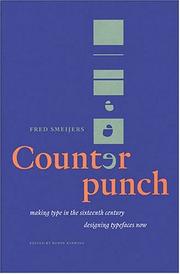
ISBN: 0907259065 Publisher: De Pinte Fontshop
Abstract | Keywords | Export | Availability | Bookmark
Loading...Choose an application
- Reference Manager
- EndNote
- RefWorks (Direct export to RefWorks)
-75084-11-0
Book history --- huisstijl --- typefaces [type forms] --- Graphics industry --- lettertypes --- anno 1900-1999 --- anno 1500-1599 --- Type and type-founding --- 766.021 --- 766.03 --- druk --- druktechnieken --- Fred Smeijers --- geschiedenis --- grafische vormgeving --- twintigste eeuw --- typografie --- zestiende eeuw --- 766:655.24 --- Typografie ; stempeldruk ; tegenstempeldruk --- Fonts (Printing) --- Founts (Printing) --- Metal types --- Type faces --- Typefaces --- Founding --- Printing --- Typesetting --- History --- Gebruiksgrafiek ; typografie ; lettertypes --- Type and type-founding. --- Caractères d'imprimerie --- Histoire --- Huisstijl --- Fonts --- Font --- 766.21.01 --- Grafische industrie en ontwerp ; schrift ; kalligrafie & lettering ; theorie, filosofie, esthetica
Book
ISBN: 3030909840 3030909832 Year: 2022 Publisher: Cham Springer Nature
Abstract | Keywords | Export | Availability | Bookmark
Loading...Choose an application
- Reference Manager
- EndNote
- RefWorks (Direct export to RefWorks)
This open access book provides a detailed and up-to-date account of the relevant literature on the legibility of different kinds of typefaces, which goes back over 140 years in the case of reading from paper and more than 50 years in the case of reading from screens. It describes the origins of serif and sans serif styles in ancient inscriptions, their adoption in modern printing techniques, and their legibility in different situations and in different populations of readers. It also examines recent research on the legibility of serif and sans serif typefaces when used with internet browsers, smartphones and other hand-held devices. The book investigates the difference in the legibility of serif typefaces and sans serif typefaces when they are used to produce printed material or when they are used to present material on computer monitors or other screens and it explores the differences in readers’ preferences among typefaces. The book’s main focus is on the psychology of reading, but there are clear implications for education and publishing. Indeed, the book can be read with benefit by anyone concerned with communicating with others through written text, whether it is printed on paper or displayed on computer screens.
Literacy --- Language: reference & general --- Teaching of a specific subject --- Legibility of text --- Reading from paper --- Reading from screens --- Sans serif typefaces --- Serif typefaces --- Typography and typographic design --- Open Access --- Llegibilitat --- Tipus d'impremta --- Caràcters d'impremta --- Caràcters tipogràfics --- Fosa de tipus d'impremta --- Lletres (Tipografia) --- Lletres d'impremta --- Impremta --- Caplletres --- Majúscules --- Ornaments tipogràfics --- Composició tipogràfica --- Retolació --- Comprensió de la lectura --- Escriptura --- Lectura --- Percepció visual --- Psicologia de la lectura
Book
ISBN: 9780900003141 9781584562719 Year: 2010 Publisher: New Castle (Del.) Londres Oak Knoll press Bibliographical society Printing historical society
Abstract | Keywords | Export | Availability | Bookmark
Loading...Choose an application
- Reference Manager
- EndNote
- RefWorks (Direct export to RefWorks)
"A survey of all Roman, Italic, Greek, Hebrew, and Arabic typefaces made in France during the sixteenth century, describing the evolution of type-casting and letter-engraving and the methodology used. Illustrated with facsimiles of 409 typefaces with detailed descriptions including their first appearance in books or type specimens"--Provided by publisher.
Book history --- anno 1500-1599 --- France --- 655.24 <44> --- Lettertypes. Lettersoorten--algemeen - niet verwarren met schrift; z.o. {003} en {681.615}--Frankrijk --- Type and type-founding --- History --- Fonts (Printing) --- Founts (Printing) --- Metal types --- Type faces --- Typefaces --- Founding --- Printing --- Typesetting --- Boekgeschiedenis --- Frankrijk
| Listing 1 - 10 of 27 | << page >> |
Sort by
|