
 Search
 Feedback
 About
About Help
Help News
News
Book
ISBN: 9788862271196 Year: 2008 Volume: 3, suppl. 1 Publisher: Pisa ; Roma Fabrizio Serra
Abstract | Keywords | Export | Availability | Bookmark
 Loading...
Choose an application
- Reference Manager
- EndNote
- RefWorks (Direct export to RefWorks)
ISBN: 9781864701883 Year: 2006 Publisher: Mulgrave Images Publishing
Abstract | Keywords | Export | Availability | Bookmark
Loading...Choose an application
- Reference Manager
- EndNote
- RefWorks (Direct export to RefWorks)
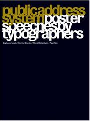
Public Address System is a collection of posters by typographers that were featured in an exhibition of the same name in London and Berlin in 2004. The brief was simple: to design an A2 poster that was a typographic interpretation of a speech.
Book
ISBN: 9781838186579 1838186573 Year: 2022 Publisher: Ifold Counter-print
Abstract | Keywords | Export | Availability | Bookmark
Loading...Choose an application
- Reference Manager
- EndNote
- RefWorks (Direct export to RefWorks)
‘Big Type’ explores graphic design and identity work where the emphasis is on typography. The visual landscape in which today’s designers are contributing to is very cluttered and the digital world alone is so vast, that sometimes it feels hard to make your voice heard amongst all the noise. The work on show within this book examines how designers can produce work that stands out and cuts through the noise. It showcases a fascinating direction in graphic design, forged by a collision of technology, typography and trends which is creating new and exciting results. Packed full of stunning imagery from some of the world’s best graphic design companies, ‘Big Type’ also contains agency interviews and enlightening project descriptions. --Counter-print
Graphic arts --- posters --- graphic design --- signage --- typography --- 655.26 --- 655.26 Soorten zetwerk. Lay-out. Typografische vormgeving --- 655.26 Typography. Graphic design. Kinds of text (material to be set) --- Soorten zetwerk. Lay-out. Typografische vormgeving --- Typography. Graphic design. Kinds of text (material to be set)
Book
ISBN: 1317012887 9781317012887 9781315551852 9781472480422 9780367787035 Year: 2019 Publisher: London Routledge
Abstract | Keywords | Export | Availability | Bookmark
Loading...Choose an application
- Reference Manager
- EndNote
- RefWorks (Direct export to RefWorks)
The typographic imaginary is an aesthetic linking authors from William Caxton to Alexander Pope, this study centrally contends. Early modern English literature engages imaginatively with printing and this book both characterizes that engagement and proposes the typographic imaginary as a framework for its analysis. Certain texts, Rachel Stenner states, describe the people, places, concerns, and processes of printing in ways that, over time, generate their own figurative authority. The typographic imaginary is posited as a literary phenomenon shared by different writers, a wider cultural understanding of printing, and a critical concept for unpicking the particular imaginative otherness that printing introduced to literature. Authors use the typographic imaginary to interrogate their place in an evolving media environment, to assess the value of the printed text, and to analyse the roles of other text-producing agents. This book treats a broad array of authors and forms: printers' manuals; William Caxton's paratexts; the pamphlet dialogues of Robert Copland and Ned Ward; poetic miscellanies; the prose fictions of William Baldwin, George Gascoigne, and Thomas Nashe; the poetry and prose of Edmund Spenser; writings by John Taylor and Alexander Pope. At its broadest, this study contributes to an understanding of how technology changes cultures. Located at the crossroads between literary, material, and book historical research, the particular intervention that this work makes is threefold. In describing the typographic imaginary, it proposes a new framework for analysis of print culture. It aims to focus critical engagement on symbolic representations of material forms. Finally, it describes a lineage of late medieval and early modern authors, stretching from the mid-fifteenth to the mid-eighteenth centuries, that are linked by their engagement of a particular aesthetic.
Printing --- English literature --- 655.26 --- 655.26 Soorten zetwerk. Lay-out. Typografische vormgeving --- 655.26 Typography. Graphic design. Kinds of text (material to be set) --- Soorten zetwerk. Lay-out. Typografische vormgeving --- Typography. Graphic design. Kinds of text (material to be set) --- History --- History and criticism --- Book history --- typography --- anno 1500-1799
Book
ISBN: 9782330167691 2330167695 Year: 2022 Publisher: Arles Actes Sud
Abstract | Keywords | Export | Availability | Bookmark
Loading...Choose an application
- Reference Manager
- EndNote
- RefWorks (Direct export to RefWorks)
En coédition avec l’AMI (Atelier-Musée de l’Imprimerie, à Malesherbes), un ouvrage conçu, écrit et illustré en hommage à Marcel Jacno, graphiste populaire du XXe siècle étrangement méconnu du dont tout un chacun connait l'une des créations au moins. --Actes Sud
766 <44> --- 655.26 --- 655.26 Soorten zetwerk. Lay-out. Typografische vormgeving --- 655.26 Typography. Graphic design. Kinds of text (material to be set) --- Soorten zetwerk. Lay-out. Typografische vormgeving --- Typography. Graphic design. Kinds of text (material to be set) --- 766 <44> Toegepaste grafische kunsten. Gebruiksgrafiek: Commerciële grafiek--Frankrijk --- Toegepaste grafische kunsten. Gebruiksgrafiek: Commerciële grafiek--Frankrijk --- Jacno, Marcel
Book
ISBN: 9076452350 Year: 2005 Publisher: Amsterdam Uitgeverij De Buitenkant
Abstract | Keywords | Export | Availability | Bookmark
Loading...Choose an application
- Reference Manager
- EndNote
- RefWorks (Direct export to RefWorks)
Publishers. Printers --- anno 1900-1999 --- Netherlands --- Jongejans, Charles --- Melle --- Stam, Mart --- 655.26 --- 373.67 <492> --- Soorten zetwerk. Lay-out. Typografische vormgeving --- Kunstonderwijs. Nederland
Book
ISBN: 071482559X Year: 1988 Publisher: Oxford Phaidon
Abstract | Keywords | Export | Availability | Bookmark
Loading...Choose an application
- Reference Manager
- EndNote
- RefWorks (Direct export to RefWorks)
Drukkunst --- Imprimerie --- Printing --- Typographie --- Typography --- 655.26 --- Marion March --- grafische vormgeving --- reclamegrafiek --- typografie --- ontwerp --- 766.02 --- Typography. Graphic design. Kinds of text (material to be set)
Book
Abstract | Keywords | Export | Availability | Bookmark
Loading...Choose an application
- Reference Manager
- EndNote
- RefWorks (Direct export to RefWorks)
655.262 MORISON, STANLEY --- 655.26 --- Boekdesign--MORISON, STANLEY --- Soorten zetwerk. Lay-out. Typografische vormgeving --- Stanley Morison --- glrafische vormgeving --- lettertypes --- 766.021 --- typografie
ISBN: 0907259235 0907259081 Year: 2004 Publisher: London Hyphen Press
Abstract | Keywords | Export | Availability | Bookmark
Loading...Choose an application
- Reference Manager
- EndNote
- RefWorks (Direct export to RefWorks)
66
Graphics industry --- Book design. --- Livres --- Mise en pages --- Boeken --- Vormgeving --- Boekvormgeving --- 655.26 --- 655.262 HOCHULI, JOST --- Soorten zetwerk. Lay-out. Typografische vormgeving --- Boekdesign--HOCHULI, JOST
Book
ISBN: 0823026558 Year: 1978 Publisher: New York (N.Y.): Watson-Guptill publications
Abstract | Keywords | Export | Availability | Bookmark
Loading...Choose an application
- Reference Manager
- EndNote
- RefWorks (Direct export to RefWorks)
Layout (Printing) --- Graphic design (Typography) --- Maquettes (Industries graphiques) --- Arts graphiques --- 655.26 --- Typographic design --- Design --- Printing --- Soorten zetwerk. Lay-out. Typografische vormgeving --- layout [composition]